Misionero Parroquial (1819) — a wild Spanish marble
Tocca qui per leggerlo in italiano.
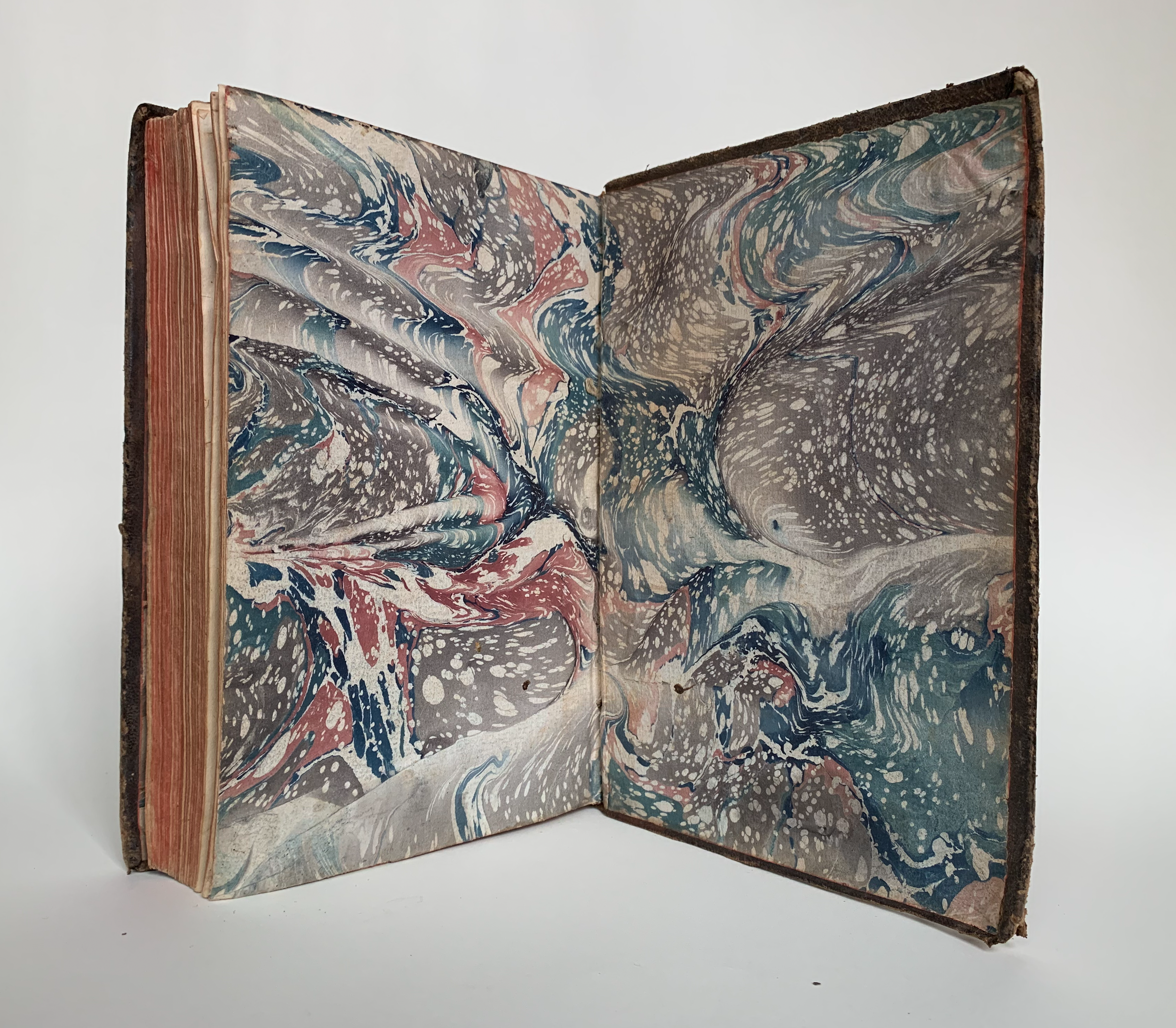
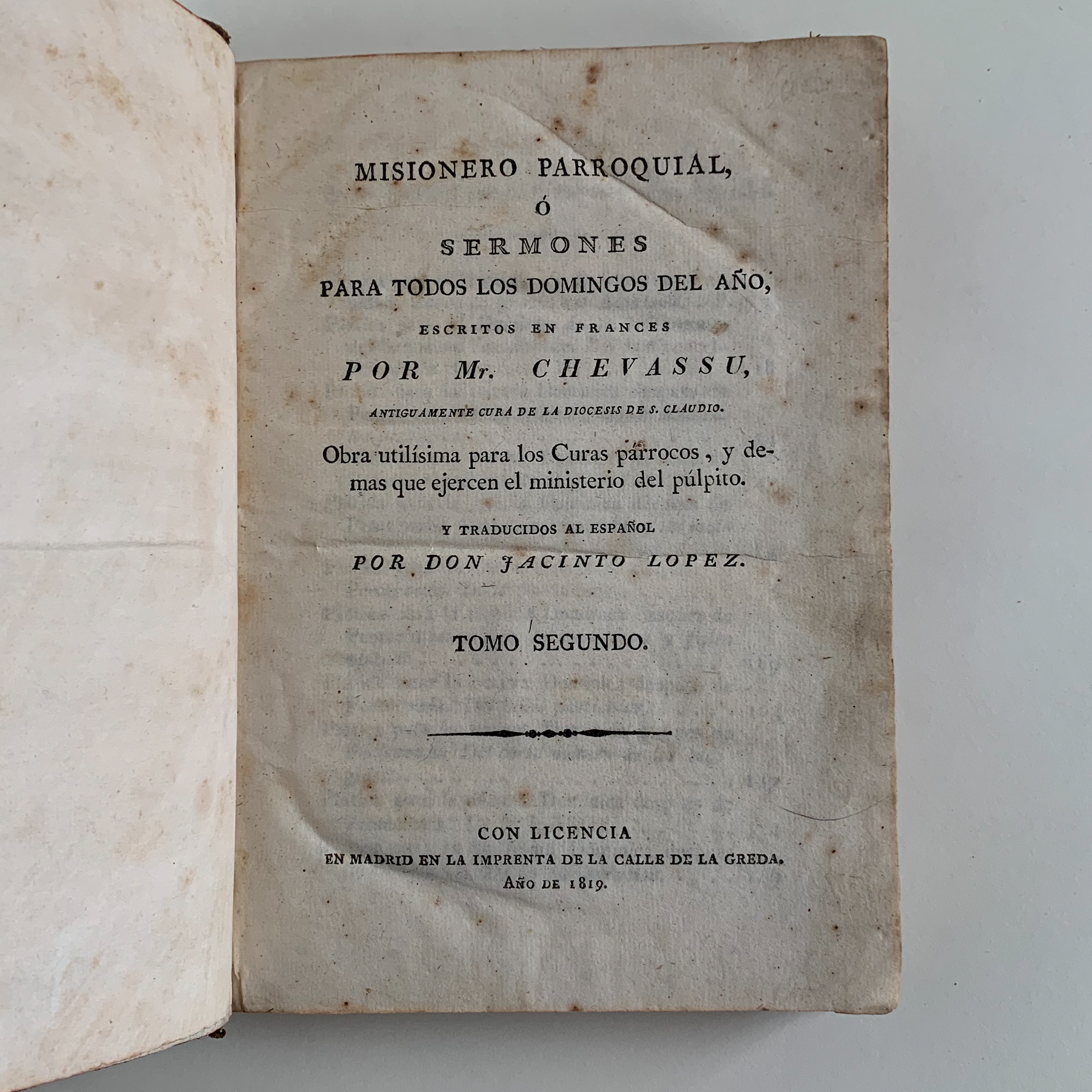
I love a wild period marble. Behold, from my collection, an early-nineteenth-century full sheepskin binding with fantastic Spanish marble endsheets. The book is a collection of sermons translated to Spanish from French, published in Madrid in 1819. I can’t be certain the binding is Spanish and contemporary to the text—books were often exported to other countries in sheets, bound years after their publication date, and rebound over time—but stylistically (especially with respect to the marble), I am inclined to believe it is Spanish, and from around the 1820s.
What is certain is that it was bound in a great hurry; you can see the hand of the binder in the various shortcuts taken for the sake of efficiency. I’ll talk more about those later.
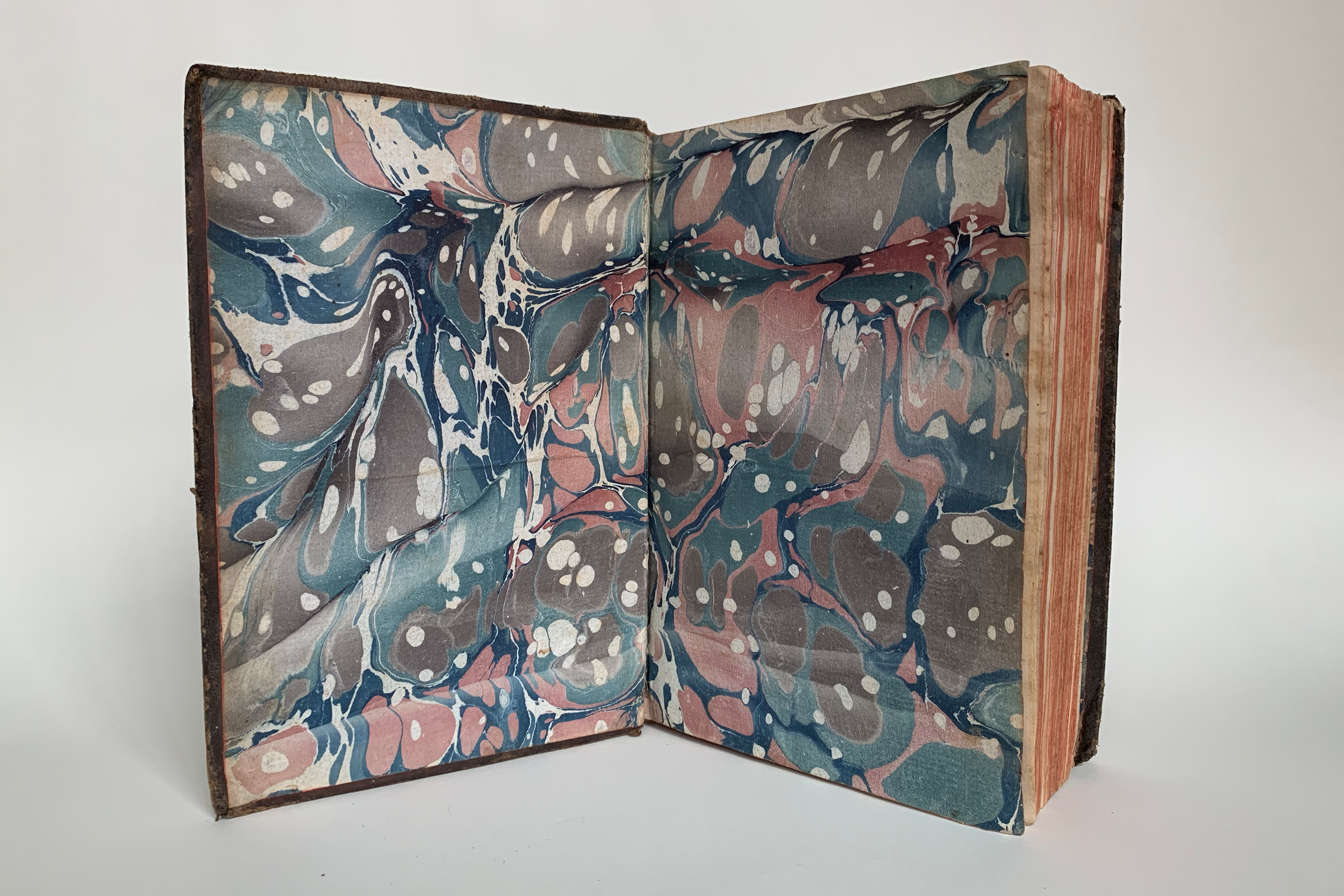
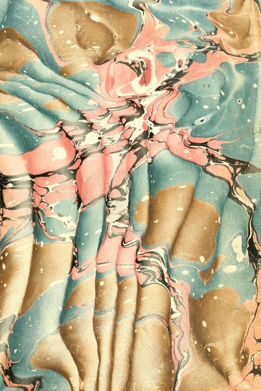
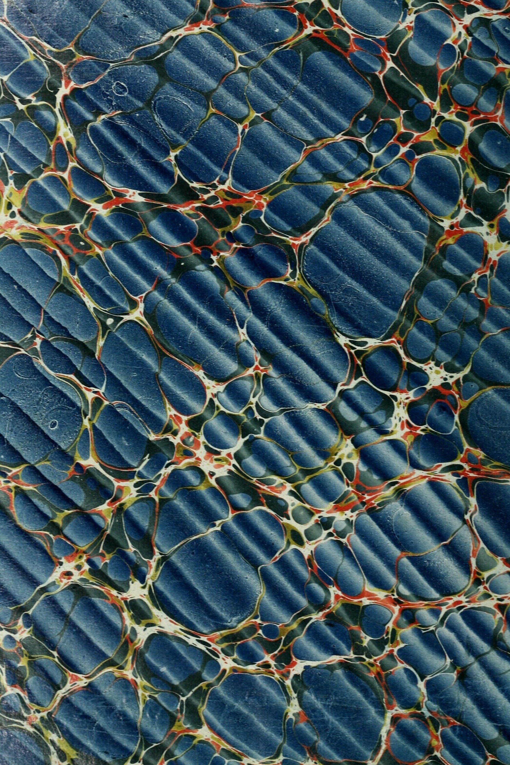
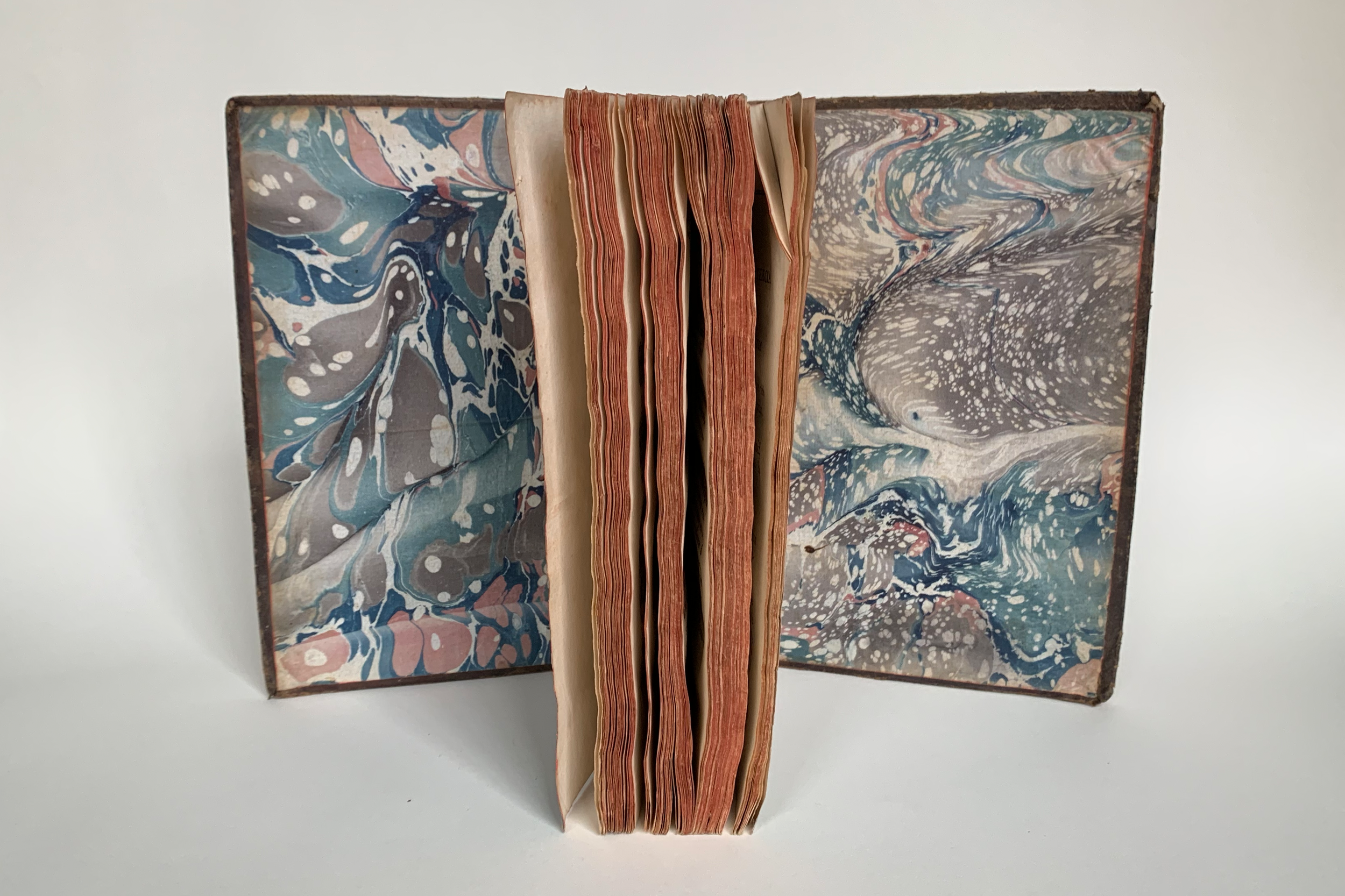
These fantastic endpapers are marbled in a manner usually called the “Spanish,” defined by the loose waves. A Spanish pattern is executed by rocking the paper while you set it on the bath. If done with sufficient force, this rocking movement pushes the pigment that is floating on the surface of the bath, which creates areas of alternating low and high pigment concentration on the sheet, and gives the resulting marble a wavy 3D optical illusion. This was usually done over a large-ish spot pattern. The technique came into use in the 1760s in Spain, and remained popular there until the 1820s, when it was displaced by the shell pattern. It so defined the marbling of Spain during those years that Wolfe says, “one automatically looks twice or thrice” when a Spanish marble from those years does not feature waves.
The wavy, uncontrolled nature of these particular endpapers is a great example of the original, truly Spanish iteration of this pattern. As Wolfe says of Spanish marbles, “The waves almost seem to have been placed in a careless manner, without purpose or intent. But this aspect, instead of being a defect, along with the soft colors, gives Spanish paper its special charm” (54). Rarely effusive, Wolfe calls them the “royalty” of marbled papers.
a true 18th century Spanish paper in the typical colors
Around the time it was losing popularity in Spain, the rocking technique was adapted and ruined (ahem) in England, Germany, and the United States, where it was executed in a highly controlled manner that resulted in dull, almost mechanically parallel waves, which Wolfe distinguishes by the name “neo-Spanish.” As he says, “While one can appreciate these later “Spanish” papers for their perfection and skillful execution, they lack the spontaneity and charm of the authentic Spanish article, which can be a pure delight” (54).
My book features two different base patterns in the front and rear endpapers, as can be seen in the above image. Both papers have the same colors—royal blue, pink, teal, and grey, set down in that order. After these colors were put on the bath, a surfactant like ox gall was scattered over the surface, creating white dots by clearing small areas of pigment. In the front paper, there are only a handful of these white dots and they are of medium size, while the rear paper has a dense profusion of tiny white dots (so many that at first glance I thought it was a Stormont). The papers might have been made on different days, or with a different concentration of ox gall, or possibly a different maker in the same shop. Much like listening to a seashell, if you put your ear to this binding, you can hear the sound of an underpaid binder saying “eh, close enough” at almost every step in the process.
“Tree-adjacent” marbled sheepskin staining
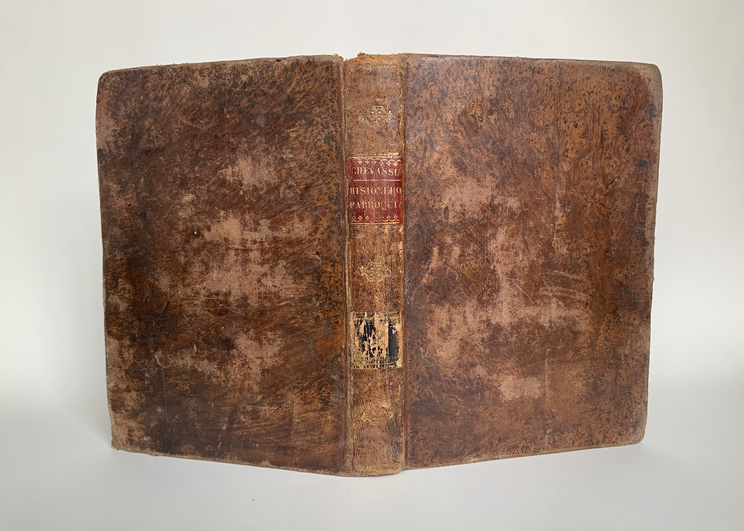
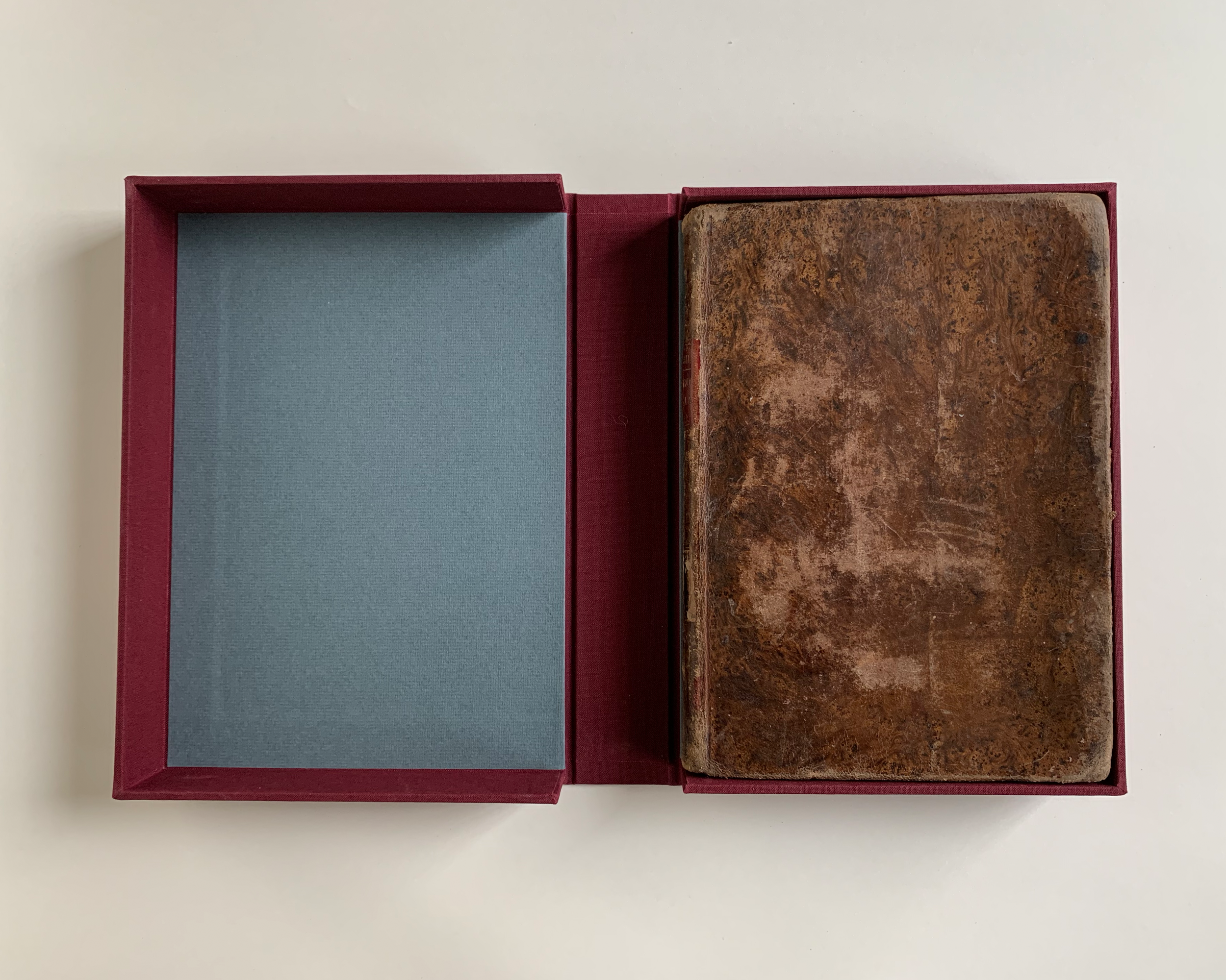
Onwards to the binding! The book measures 217 mm x 154 mm x 27 mm. It is bound in what appears to be sheepskin and shows a messy abstract or tree marble stain—it in no way resembles a tree, and it’s unclear whether that shape was the intention of the binder. In the words of Julia Miller, “It is assumed . . . that a great number of botched tree-marbled bindings were produced because it is not a simple technique and few binders really mastered it . . . in many cases it is difficult to be certain what the decorative goal was” (Miller 58).
[Marble staining on leather is not similar to paper marbling, despite the name. Paper marbling is done by dipping a sheet of water onto a bath that has pigments floating on the surface, which then transfer to the paper. What we call marbling on leather bindings is done directly on the surface of the leather, with the application of various chemicals to stain the leather and flowing water which smears that stain in a controlled manner, sometimes in the shape of a tree—here’s a video of Richard Smart, a modern binder, making a tree marble on a calfskin binding.]
“But boss, the title doesn’t fit.” “Eh, close enough.”
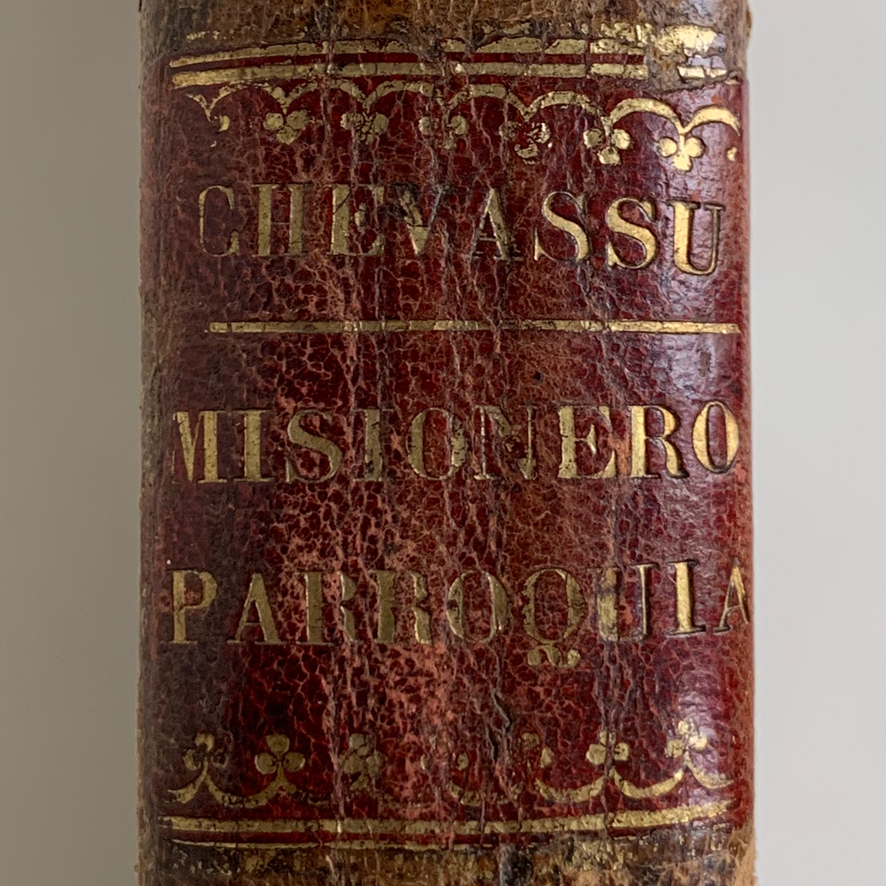
The board edges have no apparent tooling, though they are heavily worn. There is also no tooling on the covers, but the smooth spine is tooled. It has two lettering pieces; a decorative tool centered above, between, and below the lettering pieces; and a floral decorative roll at the head and tail.
The red lettering piece looks like it was titled with a typeholder—the binder chose type that was too big to fit the entire last word (a common choice), so it reads PARROQUIA instead of PARROQUIAL. The black lettering piece bears the volume number, and both lettering pieces have decorative rolls on either side (different for each label).
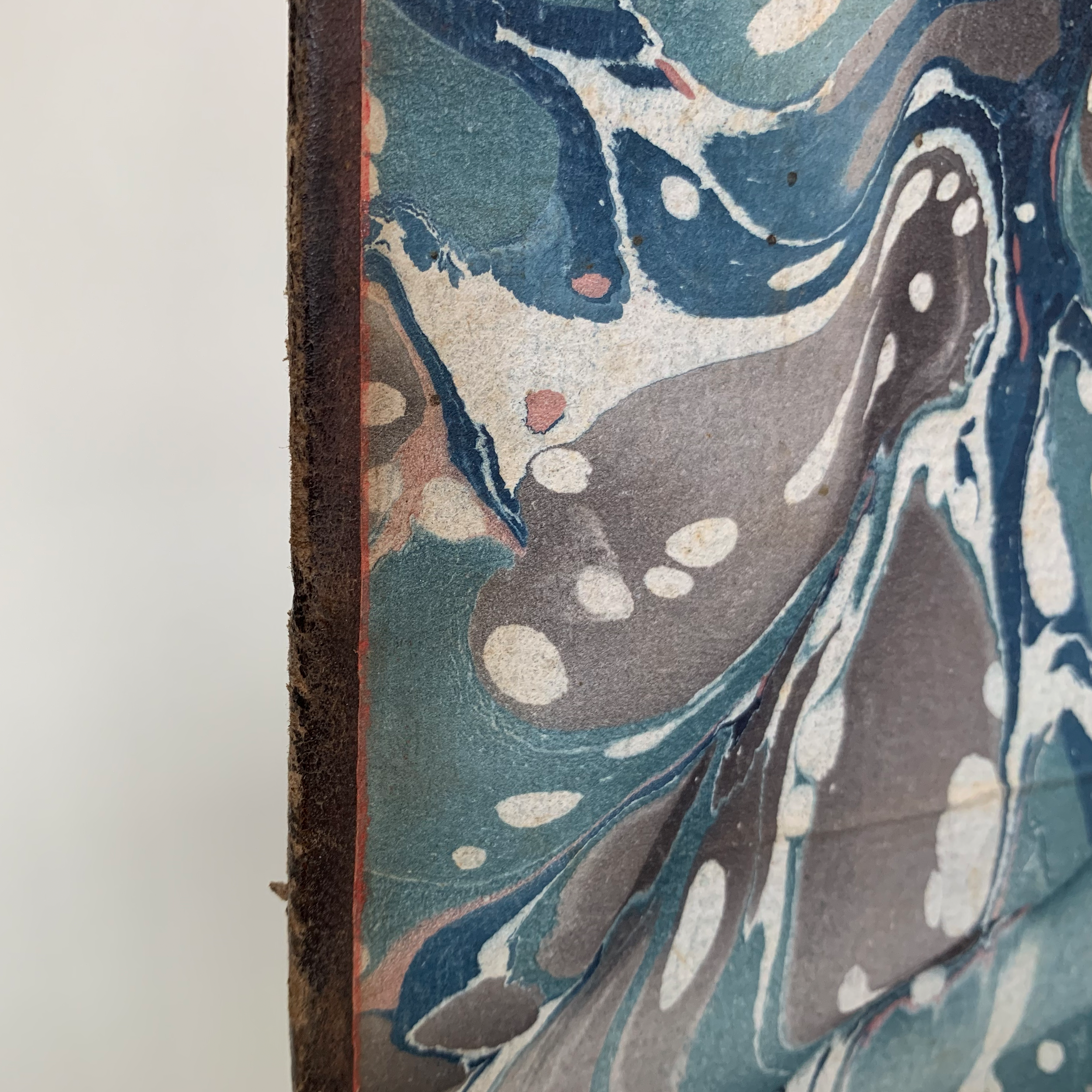
Red on the edge of the pastedown.
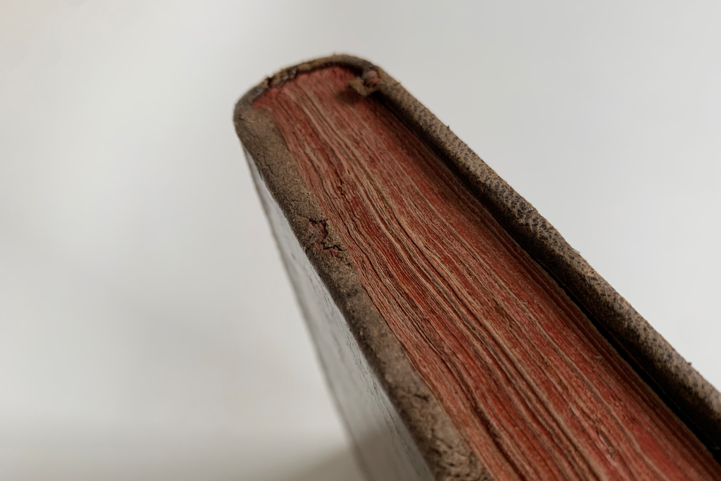
The book has solid red edges; in one spot, the leather on the board edges has worn away to reveal red staining there as well—edge decoration at this time was done after the boards were attached but before the book was covered with leather, so the board edges were stained with the textblock. The marble is contemporary with this edge decoration, and you can see the slight seepage of red onto the pastedowns. I love to see that kind of evidence!
After the endpapers, my favorite thing about this book is the board attachment. The boards are laced on, with the cords brought back in and crossed in the French manner, but under the pastedowns, it can be felt that the long ends were neither trimmed nor frayed out. Some are so long they traverse the whole width of the pastedown.
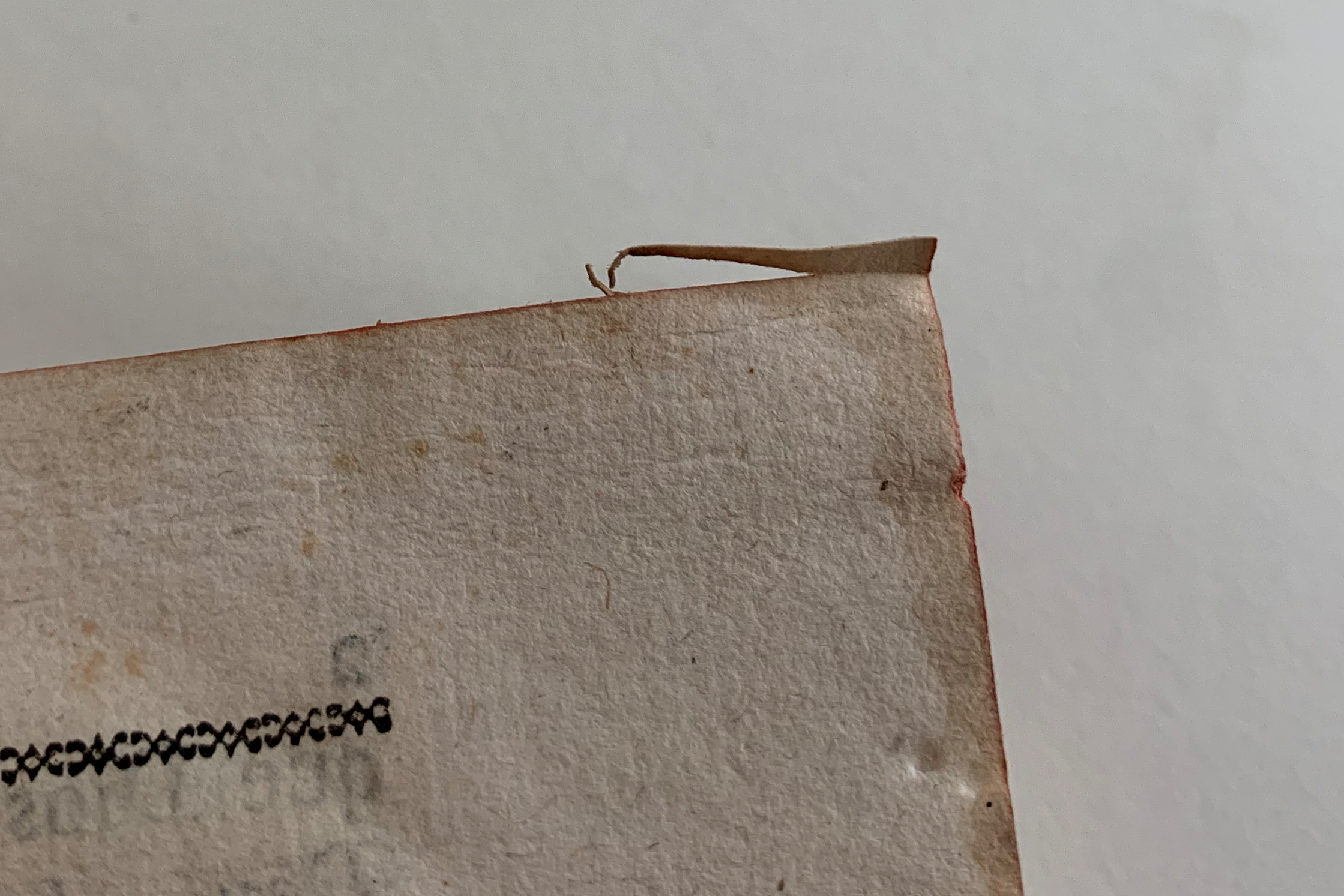
A pre-ploughing folded corner.
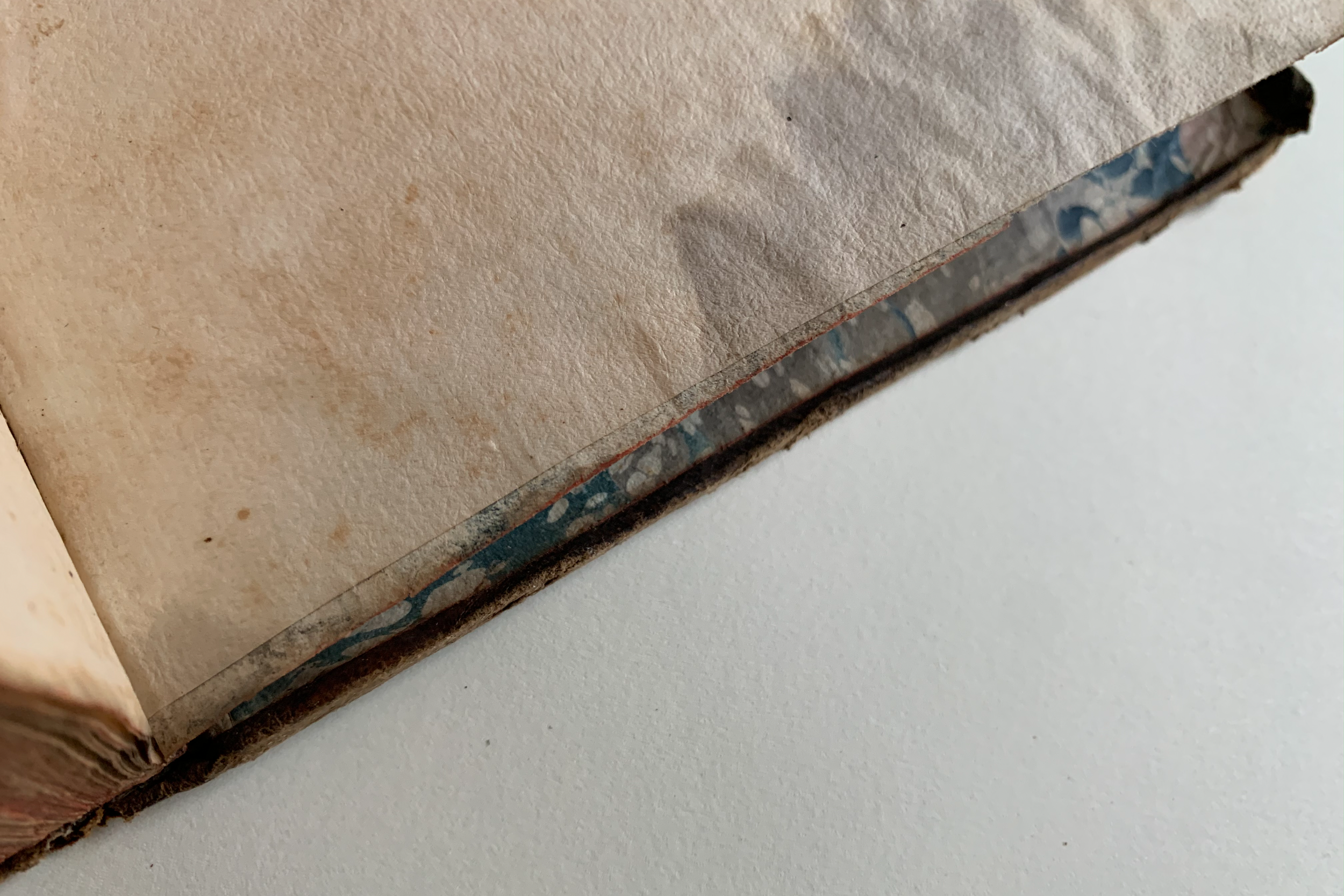
The made fly.
If there are any dog ears or folds at the corners that extend below where the book edges are ploughed (trimmed), they make a funny shape when opened afterwards. This book has plenty of these pre-ploughing folds (Ligatus LoB calls this a témoin but Lisa Muccigrosso calls it a devil’s hangnail, which is my preferred term). The flyleaves are also really sloppily made, another thing I love—the plain leaf to which the marble is made is a few millimeters shorter than the marble and than the rest of the textblock. This binder did NOT have time to make adjustments! Close enough!
I love all the ways in which the hands of the binder can be seen in this book. I’ve chemically consolidated the leather and built it a clamshell for protection. At the time of posting it’s the only [presumably!] Spanish book in my binding collection.
Miller, Julia, “Beyond Tree Calf: Bindings Decorated by Staining,” in Meeting by Accident: Selected Historical Bindings, 9–128. Ann Arbor, MI: The Legacy Press, 2018.
Wolfe, Richard J. Marbled Paper: Its History, Techniques, and Patterns. New Castle, DE: Oak Knoll Press, 2018.
