Fables for the Ladies (1811) — cheap and lovely
Tocca qui per leggerlo in italiano.

Fables for the Ladies joined my collection maybe eight years ago, and if I remember correctly, I bought it because of the title, not for the pretty binding, pleasant proportions, and charming lack of squareness, none of which were apparent in the blurry online listing—probably why no one else had bought it.
Fables feels lovely in the hand. I’m forever fascinated by why certain books are so haptically satisfying, and this is a perfect example. I keep a list of particularly pleasant-to-handle books, recording their various dimensions and materials in the hopes of finding a secret formula for the perfect handfeel—though such a formula would surely be dependent on my own anatomy and preferences.
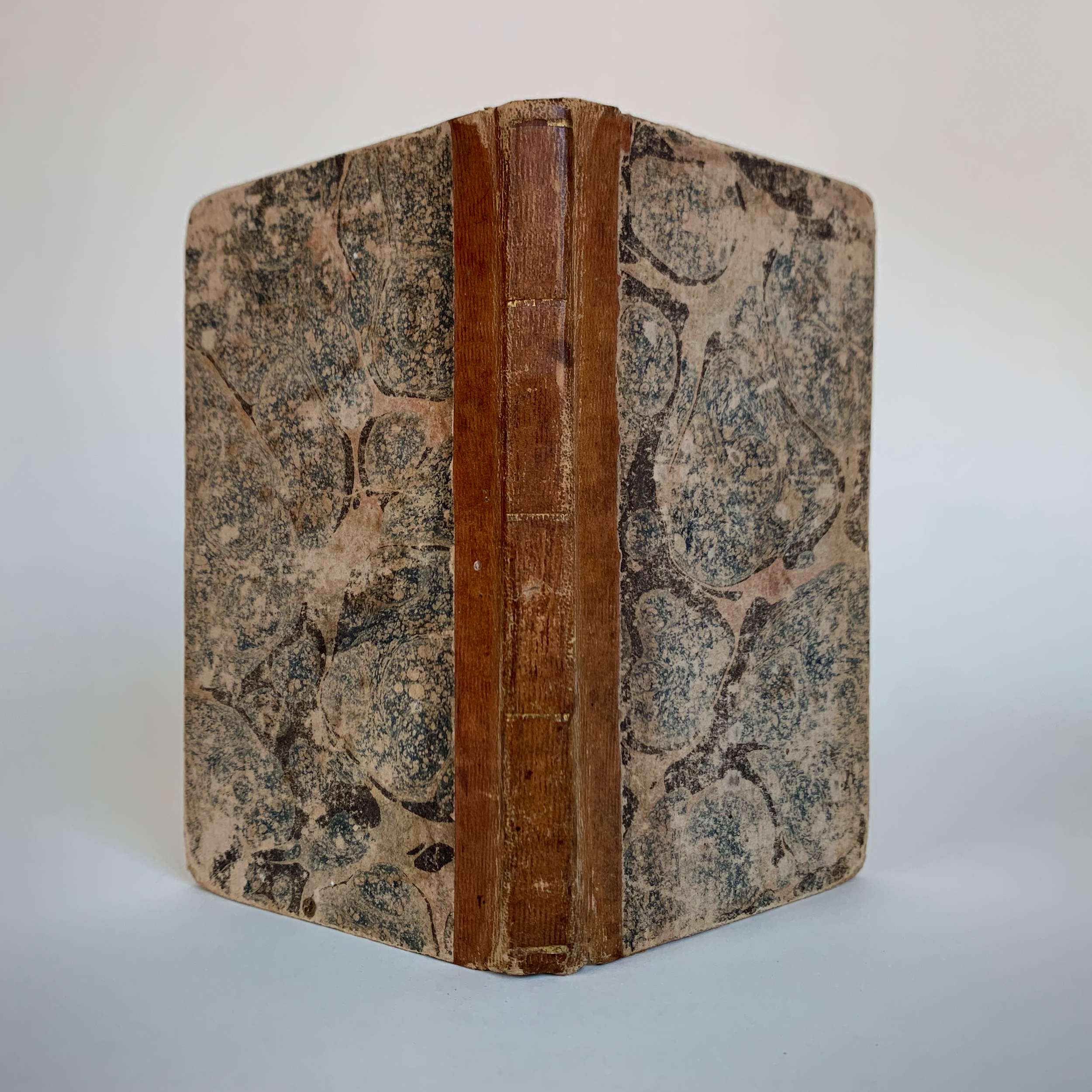
Fables for the Ladies is a sweet example of a cheapish American binding of the early nineteenth century. I believe the binding to be roughly contemporary to the stated 1811 printing. It has a quarter leather spine (looks to be calf), blue sprinkled edges, and marbled paper sides. In the photo below, you can see that the spine leather has been grained with vertical lines.
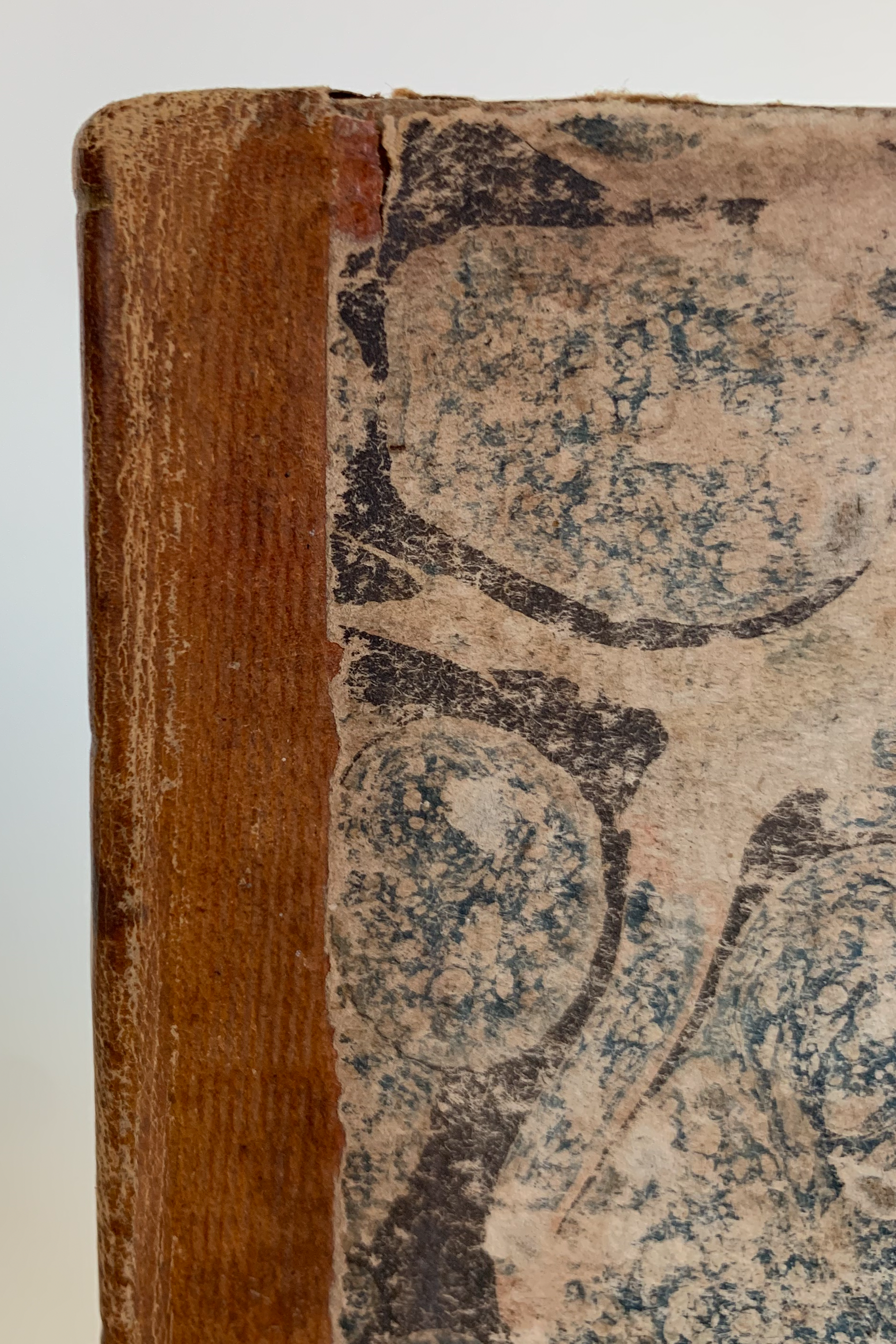
Interesting pattern of vertical lines on the leather.
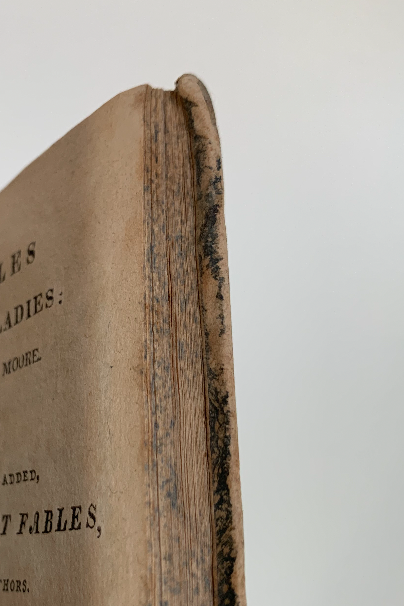
Blue sprinkled edge.
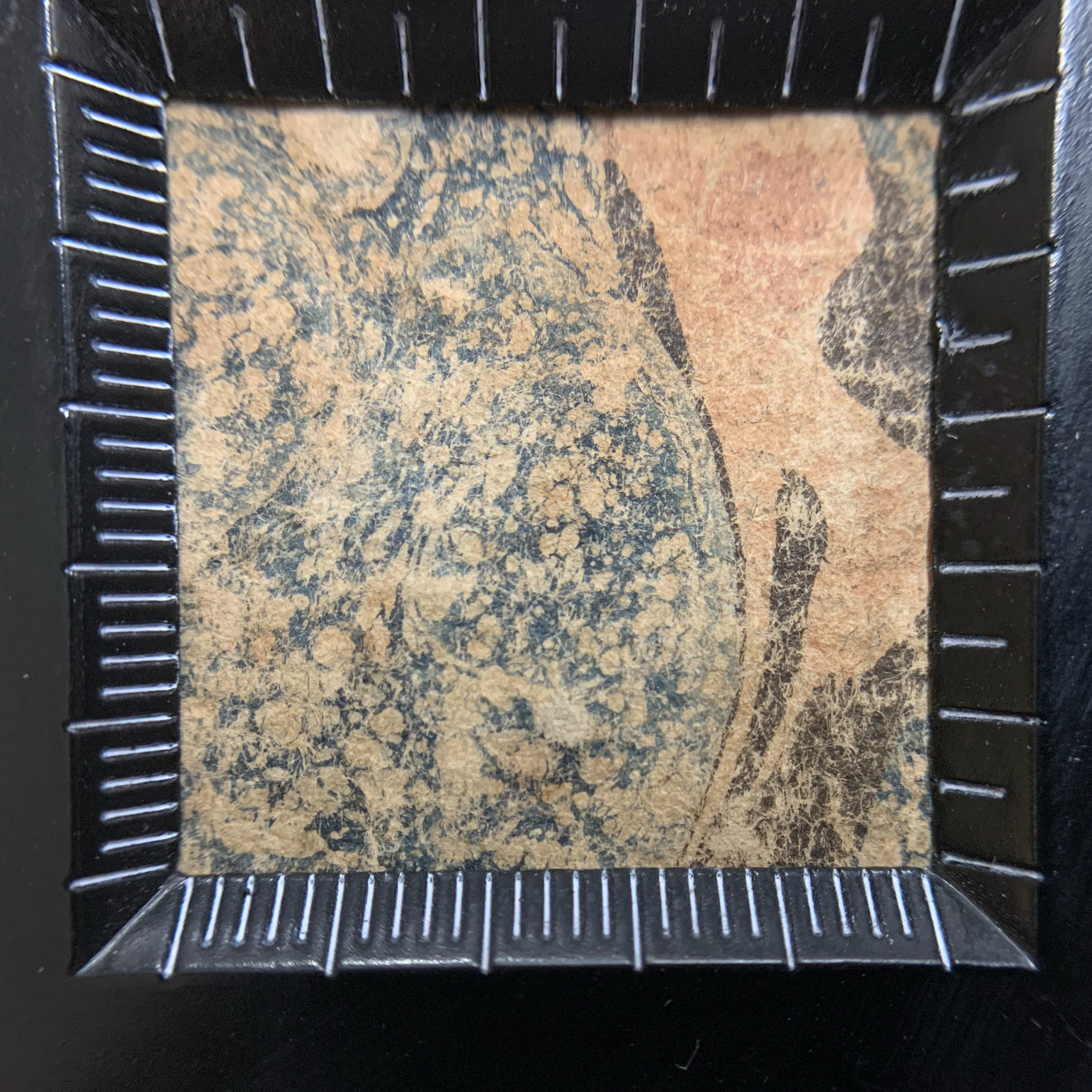
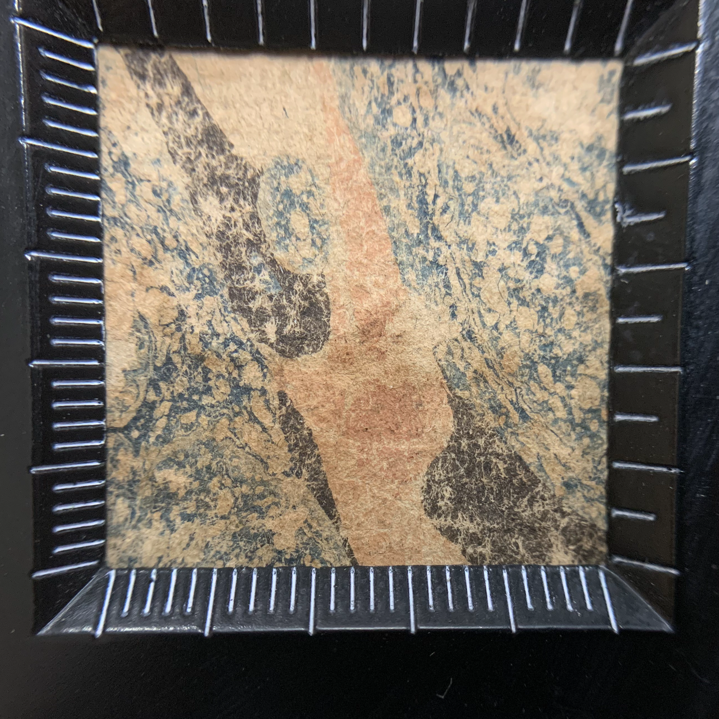
The marble, a large Stormont pattern, is charmingly out of scale to this tiny book. It has pink veins (possibly faded red), black, and turpentined blue, dropped in that order.
Stormonts are defined by the inclusion of turpentine in one or more of the colors, which ideally creates a pattern of small, lacy holes in that color.
Wolfe’s research led him to believe that the Stormont design came about in the late 1790s or very early 1800s, probably in France. It quickly spread to Germany, England, and the United States [much like a color with too much surfactant in it hey-o]. It was the dominant pattern in France and England until around 1820, longer in the United States.
The name “Stormont” is a mystery. In most English-speaking countries, it is used because Charles Woolnough called the pattern by that name in 1853 in his influential marbling manual—however Woolnough was the only person to use that name, and Wolfe could find no connection to Stormont, Ireland. Other equally unhelpful names include “French” (Sinclair 1815, Sumner 1854) and “Empire” (Guilleminot-Chrétien 1987).
Wolfe posits that the Stormont was surpassed in popularity by the shell pattern due to the difficulty of working with turpentine—it is apparently quite difficult to maintain the colors and keep the holes “small, fine, and even” because of how quickly turpentine evaporates and because of the way turpentine interacts with other ingredients. Twice in Marbled Paper, Wolfe tantalizingly refers to a “special trick” for handling the turpentined colors for this pattern which renders its production “commonplace,” but fails to share that trick. Rude!
I’m always wary of attributing a marble to the stated city or even country of publication (in this case Philadelphia), but this marble is quite similar to an early American example in Wolfe, Plate XXX, number 85. See pages 185–187 in Marbled Paper for more about the Stormont.
The out-of-squareness is most noticeable when looking at the text’s upper margin.
One of my favorite details is that the head (and only the head) of the book was ploughed well off the square. As Lisa Muccigrosso put it, “The eight-year-old that ploughed it probably wasn’t being paid enough to go back and fix it.” The other edges are trimmed pretty close to ninety degrees. The boards were trimmed to match the textblock on all sides, so the boards are equally out of square.
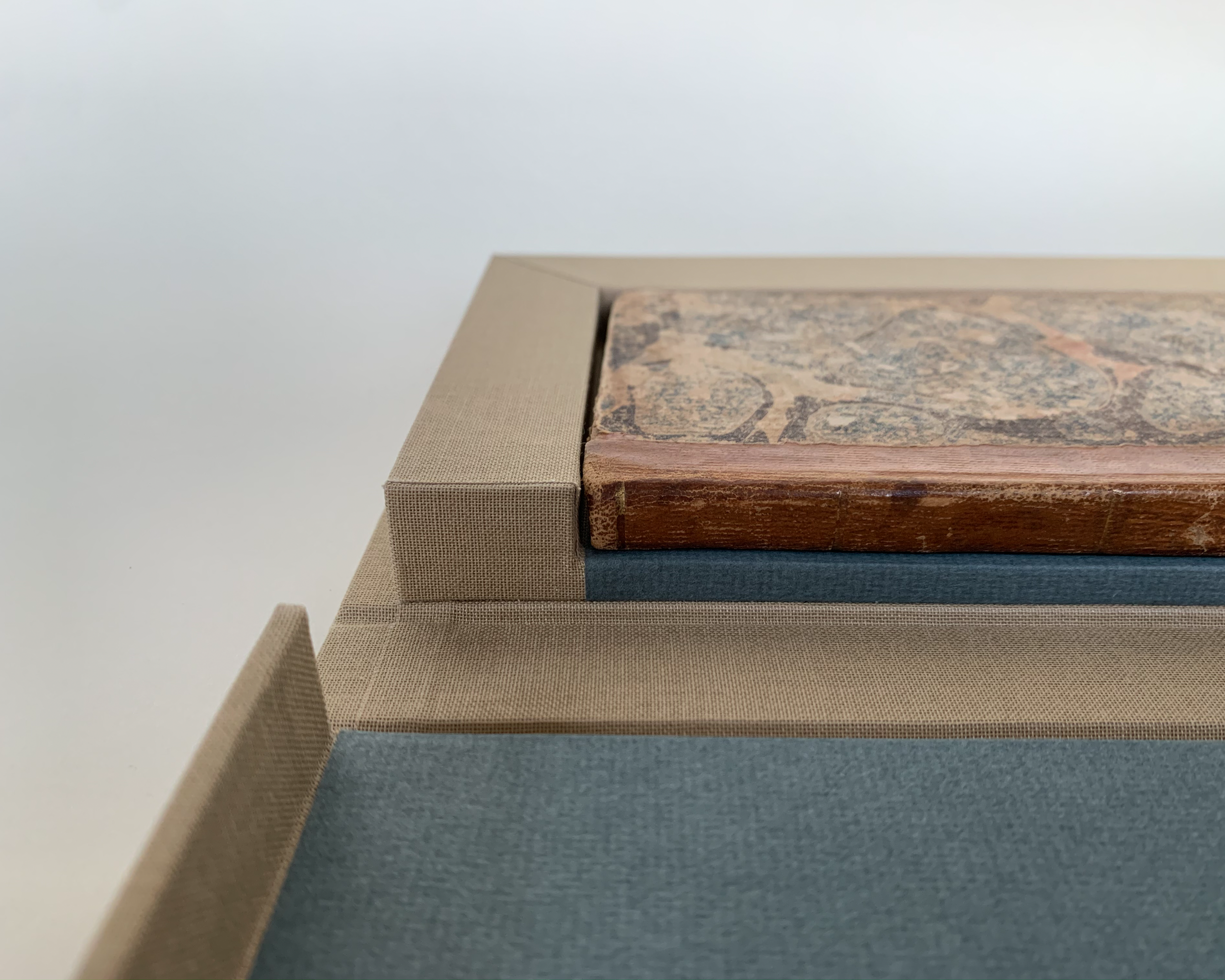
It’s also apparent when Fables is in its clamshell.
The spine is tooled with five single gold lines. There is no titling on the spine, and I see no evidence that a label or lettering piece was lost. The book is sewn two-on on recessed cords. It has eight six-folio sections, of which it seems that the first and final leaves form plain pastedowns (known as integral endleaves or sometimes “self-ends”). There is no evidence of endbands of any sort.
The turn-ins of the siding marble appear to be folded in the way that Julia Miller, in the context of scaleboard bindings, calls “pleated cornering” (Miller 280)—no material is removed; instead the corners are folded twice and laid down as they are. The boards here are fiber, and curve around the corners of the textblock, partially due to the large size of the squares (4 mm at their deepest!) and thin boards (1.75 mm).
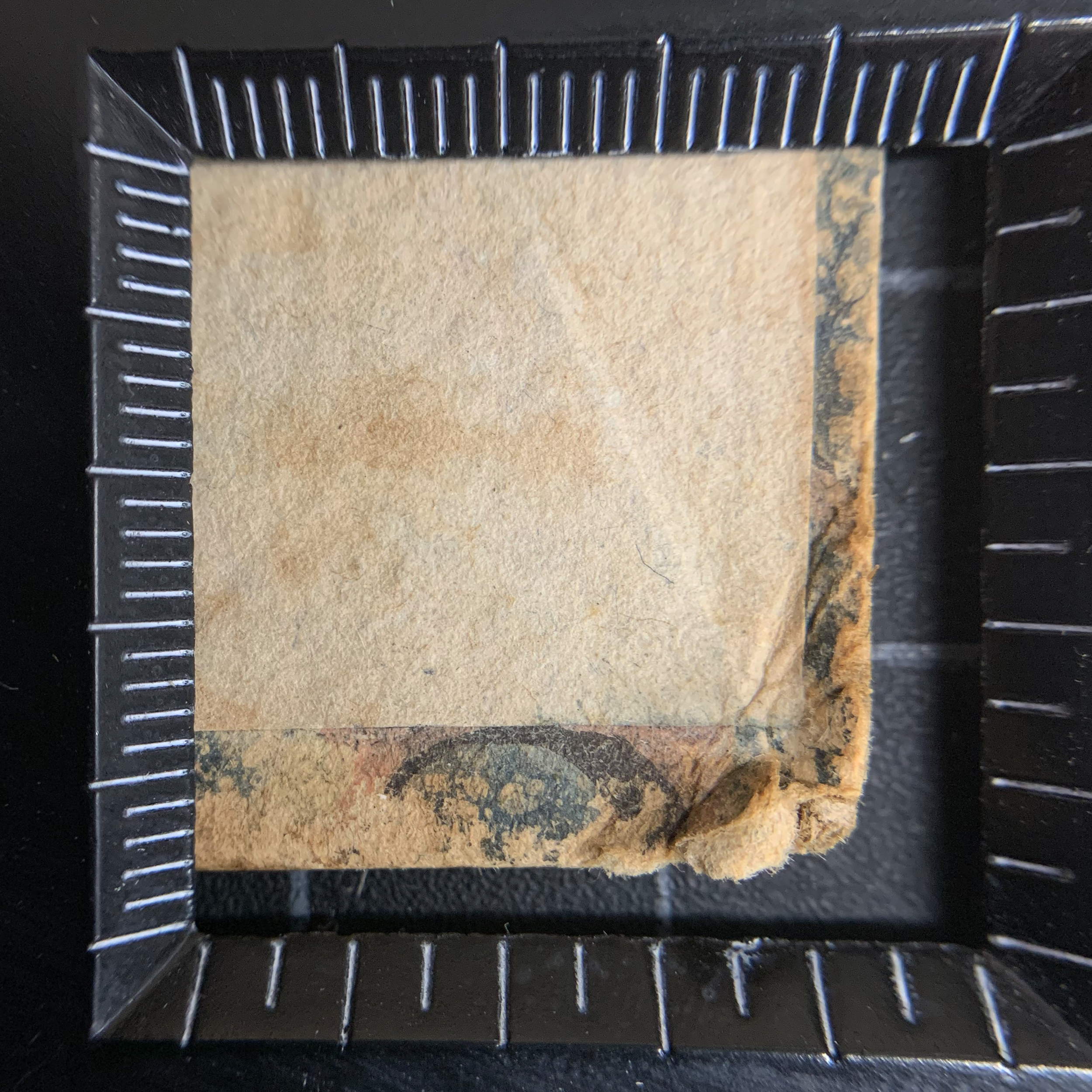
The pleated corner, and an excellent unfaded patch of the Stormont marble’s pink vein.
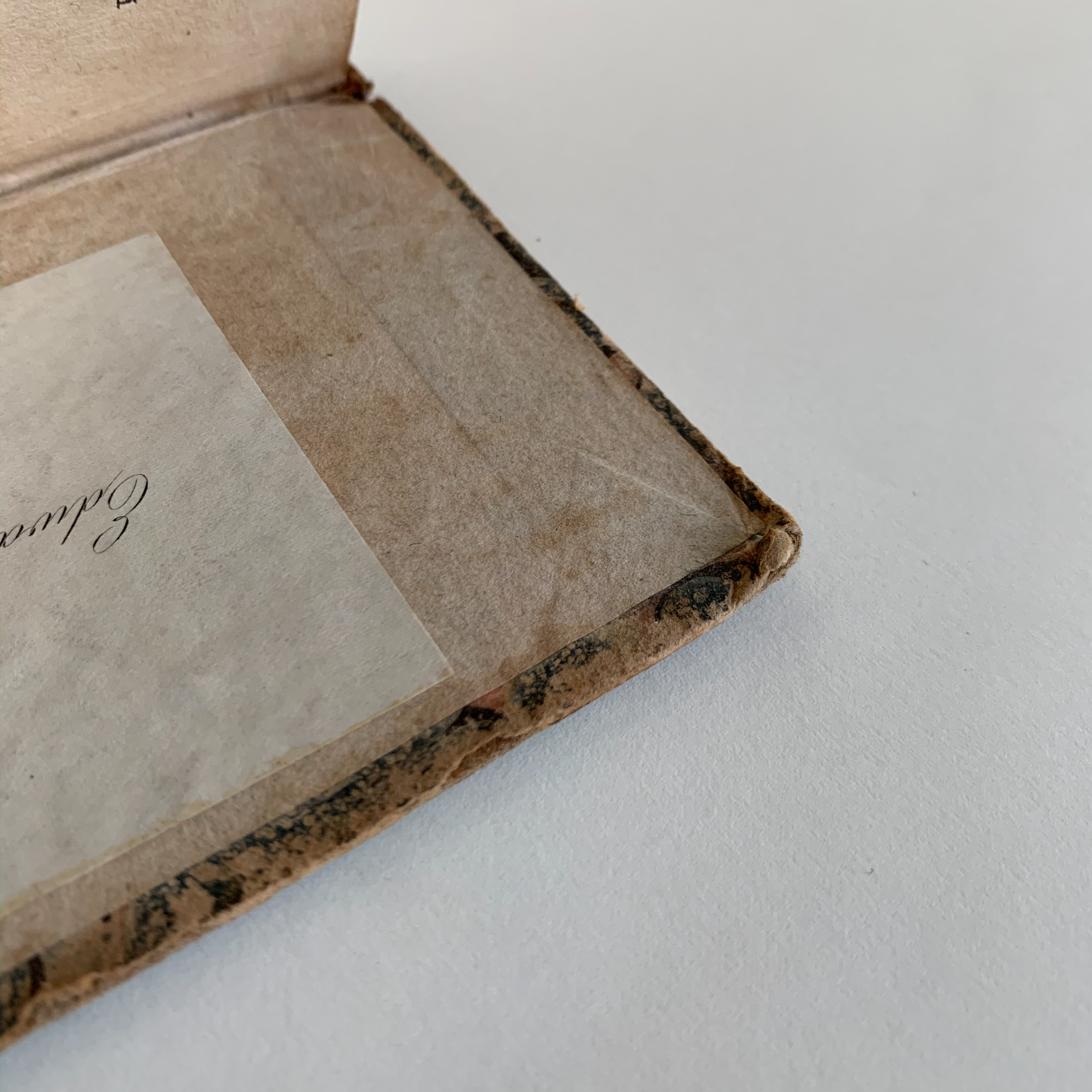
Another view of a pleated corner (and the bookplate on the paste down).
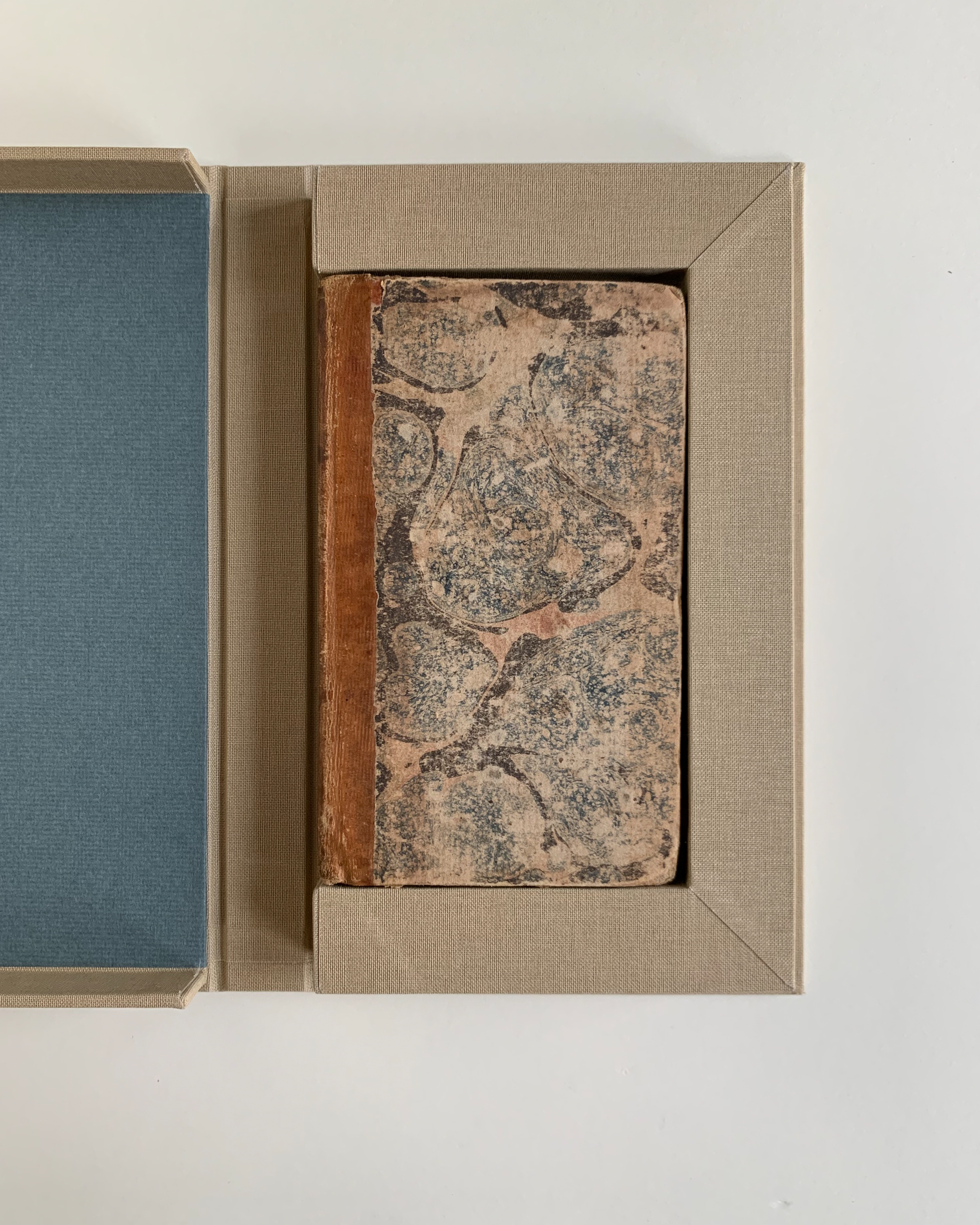
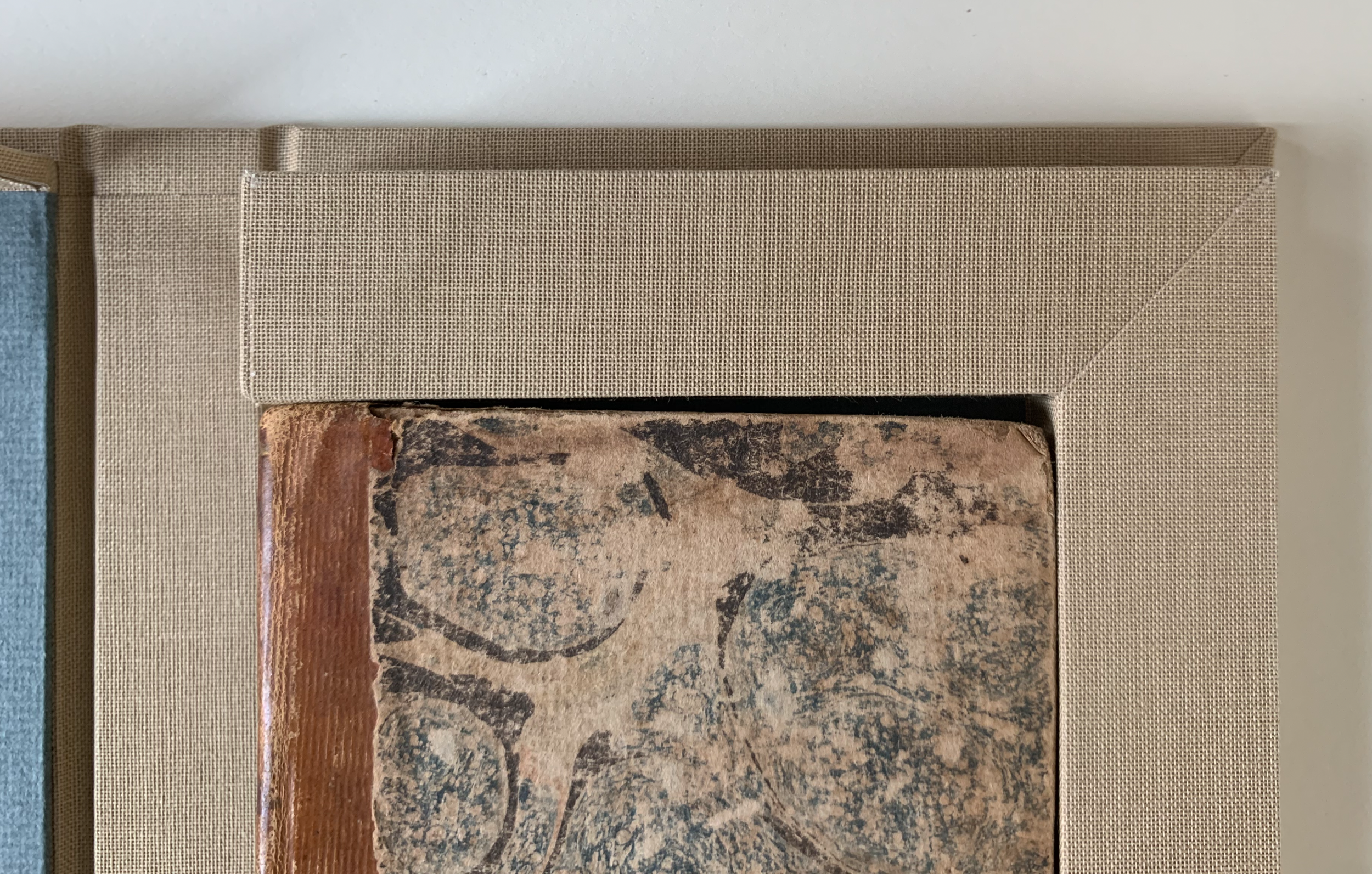
I recently built a modified clamshell to house Fables. Due to the book’s small size (88 mm x 145 mm x 10 mm) , a regular clamshell would be inadvisable—short tray walls sometimes lack sufficient friction to hold the clamshell shut. (I personally use 15mm as the minimum object depth for which I’ll make a regular clamshell.) Instead I’ve bulked out the height, width, and depth of the tray with a frame which makes it close more securely and makes the book a little larger on the shelf, preventing the average-sized books shelved next to it from warping over it. (As the National Archives say, “Interspersing short and tall volumes in a vertical unit must be avoided, since the taller volumes need the support of their neighbors to avoid warping.”) You can see more of this clamshell here.
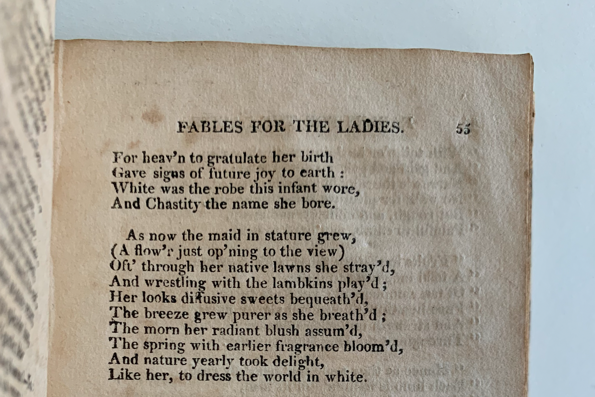
What exactly defines a lady’s fable? File this book under needlessly gendered products, early-nineteenth-century edition.
I’ve placed it in the binding section of my special collections, under lovely, simple trade bindings.
Miller, Julia, “Not Just Another Beautiful Book: A Typology of American Scaleboard Bindings,” in Suave Mechanicals: Essays on the History of Bookbinding Vol. 1, edited by Julia Miller, 246–315. Ann Arbor, MI: The Legacy Press, 2013.
Miura, Einen. The Art of Marbled Paper: Marbled Patterns and How to Make Them. New York, NY: Kodansha International, 1991.
Ritzenthaler, Mary Lynn. “Guidelines for Shelving Bound Volumes.” National Archives and Records Administration. National Archives and Records Administration, 1990.
Wolfe, Richard J. Marbled Paper: Its History, Techniques, and Patterns. New Castle, DE: Oak Knoll Press, 2018.